
The Binge App
The Binge app serves as a companion for film and TV lovers to use while watching their favorite programs.
Role: UX/UI Designer + Strategist — 5 months
Tools: Sketch, Invision, Adobe Illustrator
Problem
Users aren’t able to find the content that they love (soundtracks, playlists, podcasts etc) based on the TV and movie programs they watch, or programs similar to their preferences.
Solution
The hypothesis is that the “Browse/Surf” feature of the app will allow users to find content based on their pre-existing TV and movie preferences. The “Surf” page would include recommendations based on programs or similar programs watched, what’s trending, and what a user’s friends are consuming.
Goal
The goal is to launch the application and gauge whether or not app is needed or not. Quantifiable by the number of users able to find the content they love, specifically using the Surf feature.
Generative Research & Exploration
User Research Purpose
Trying to access who the users were and general user behavior —
with both music and TV streaming apps
Learn pain-points
Main Takeaways
Users faced difficulties navigating to their friend’s pages
Appreciated app’s recommending new and popular songs
Liked using Shazam to find music from songs
Liked Hulu integration with Spotify
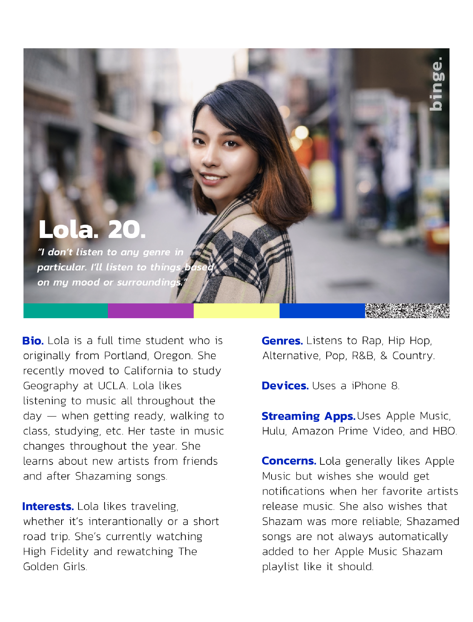
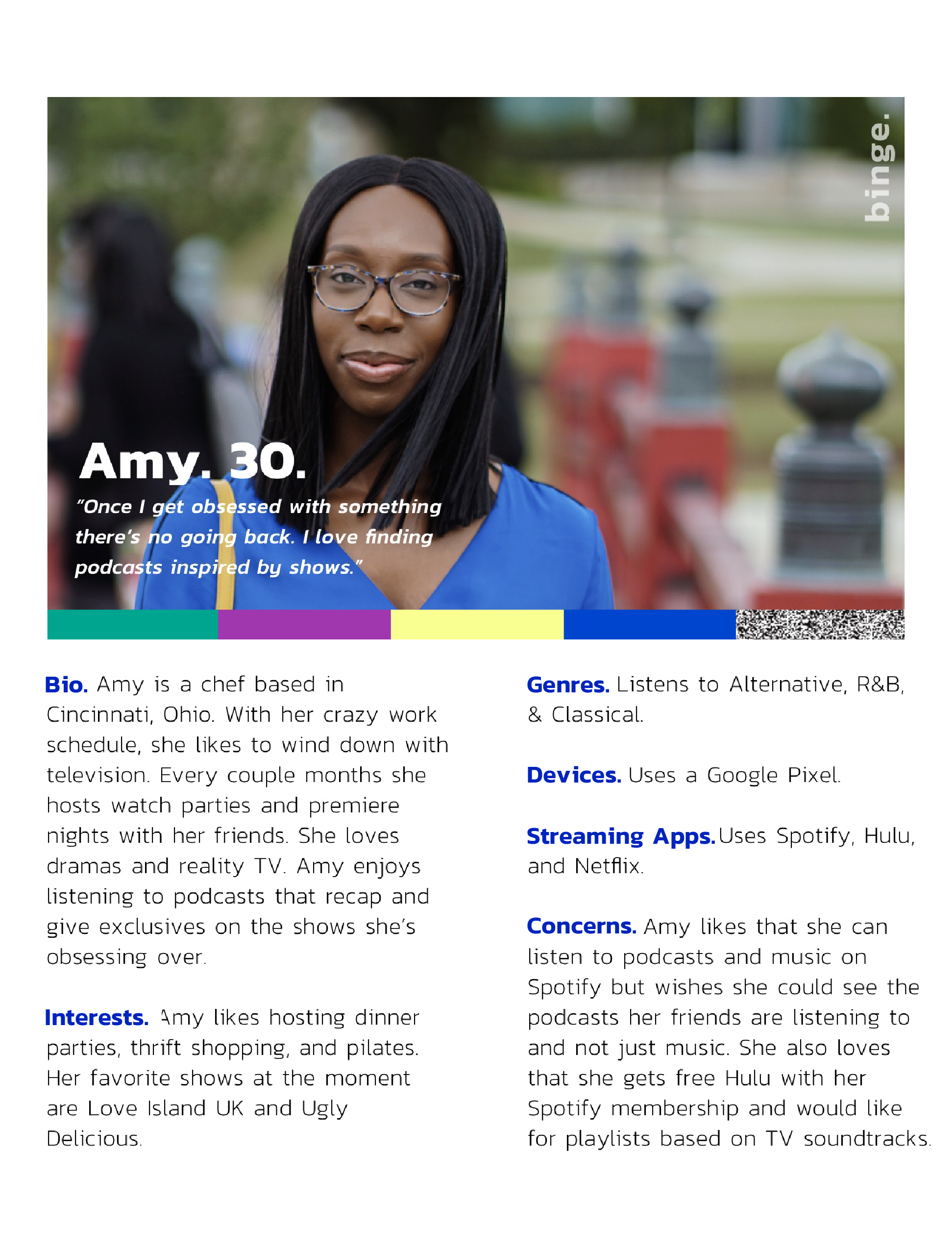
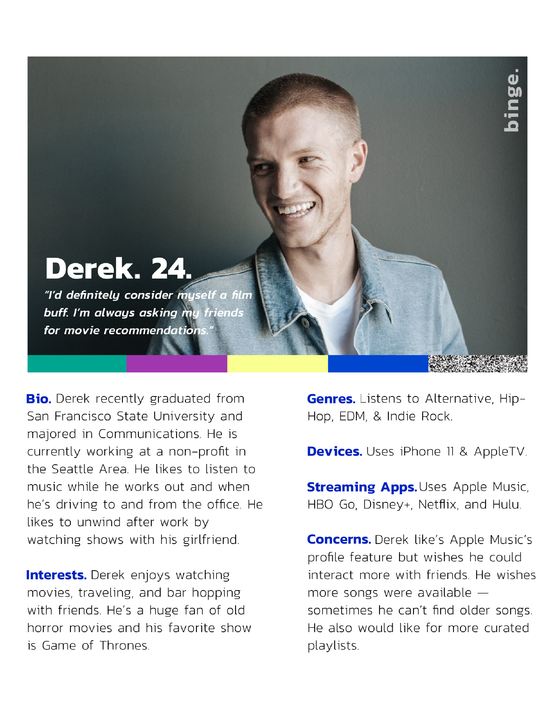
*Names and images have been changed
User Personas
Personas based off of user research
Demographics of those who use music and TV streaming apps
Napkin Sketches

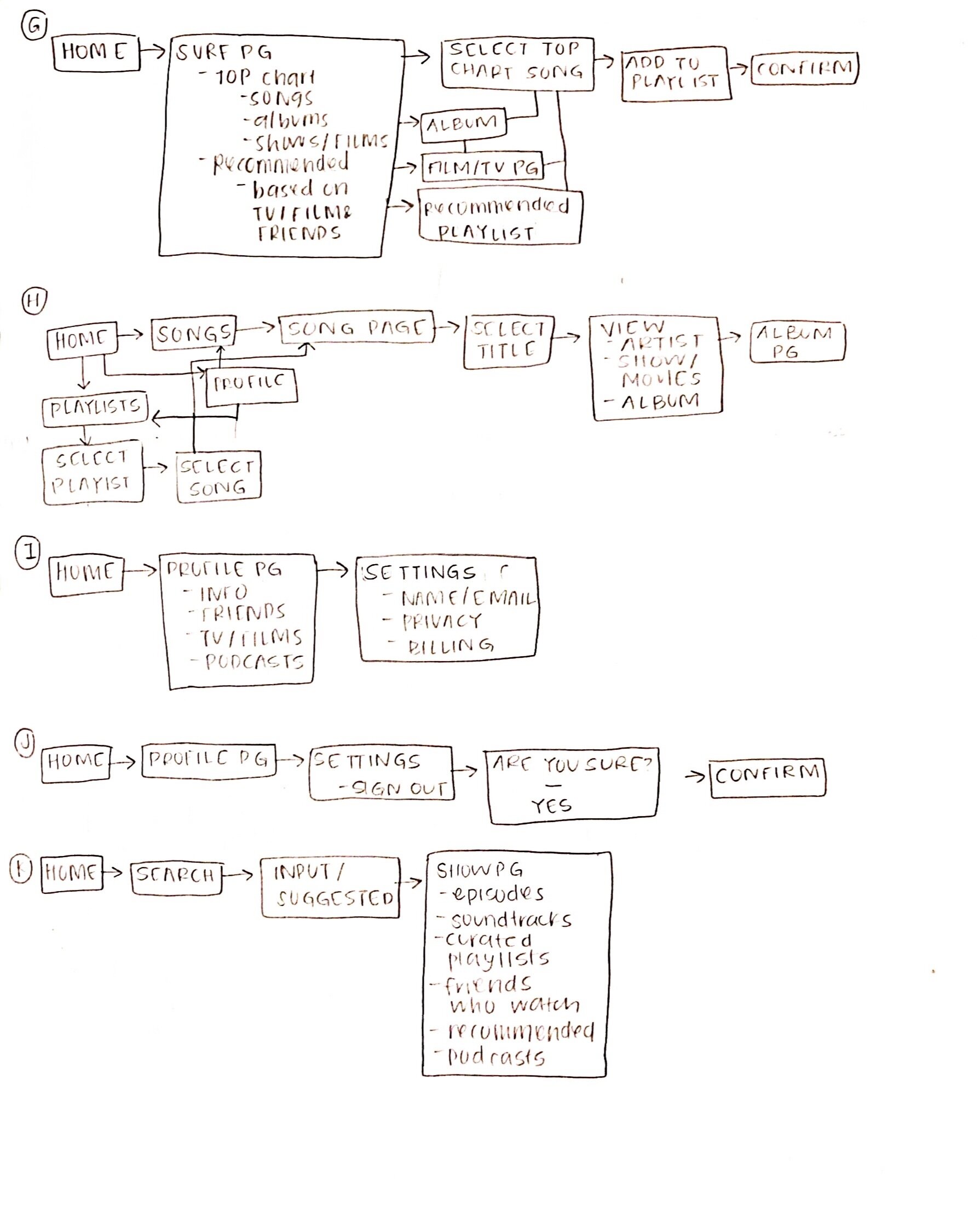
Binge being a new app, user flows were based on familiar navigation of competing music and entertainment streaming apps
Navigation mapped out based on user’s pain points and favorite aspects of streaming apps. Some of the following features incorporated include:
New Feature — Surf/Browse allows users to view top charts and recommendations based off of friends and program preferences from Hulu and Netflix
Playlist pages
Friend’s pages
Program pages based off of movies and TV shows
User flows mapped based off of feedback from user interviews
Evaluative Research
Low Fidelity Wireframes
Wireframe created based on workflow that was thought to be most familiar to users interviewed
Asked users to complete the following using the low fidelity app
To start/link account
To add and remove a song from a playlist
To navigate to the browse/Surf page and find a program page


Insights From User Testing
Main Challenges
Hierarchy of icons — wanted their personalized items like the songs they recently played to be at the forefront, not the recommended or popular items
Feedback
Initial login easy and familiar
Liked linking accounts
Liked the channel surf/browse and programs page and felt it was easy to navigate despite being an unfamiliar feature
Solutions
Keep the hierarchy in mind when designing i.e. making sure colors and text of recommendations don’t overpower the music they prefer
Edit spacing of items on the programs and surf/browse pages for ease of use

High Fidelity App